Published 06/07/21.
Regardless of the instrument used or the handwriting style, penmanship can be applied on a range from pure art to class notes. Penmanship by itself is a worthy endeavor, regardless of the intended result or application. Within the realm of penmanship are various forms of handwriting, such as italic, cursive, manuscript, and calligraphy. In this post, we’ll look at the history and usage as well as the differences in cursive vs calligraphy.
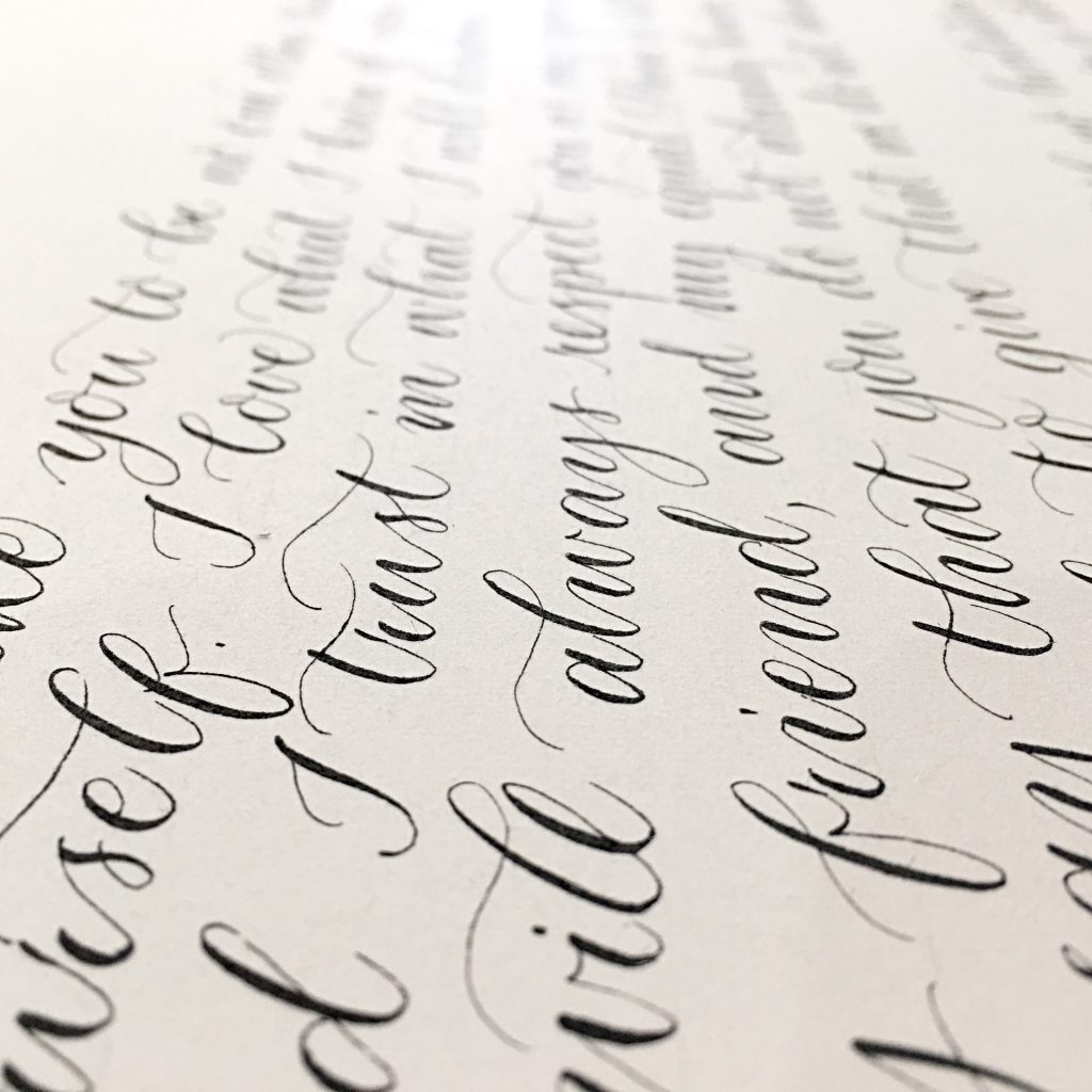
In general, Calligraphy refers to creating art through the use of decorative letters. This form of handwriting is not meant for casual use but rather an artistic use. Modern examples of handwritten calligraphy can be seen in unique wedding invitations, college degrees, and award certificates.
Calligraphy can also be written in any form of handwriting. Some of the earliest examples of calligraphy come from Persia, around the fifth and sixth centuries BC. In China, early forms began to be used around the second century BC. Calligraphy is found throughout the world, from Asia to its early Latin roots in Europe and all the way to the new world’s Mayan hieroglyphic calligraphy.

The use of connecting letters generally defines cursive. In this definition, there is looping cursive and italic cursive. Both styles of cursive connect the letters without lifting the pen. However, italic handwriting can be written with the letters separated or connected. An excellent example of modern italic is the Getty–Dubay Italic method. In contrast, looping cursive does not have an unconnected counterpart. The Palmer Method is a style of looping cursive, evident by its looping letters such as the cursive g and the connection between each lowercase letter.
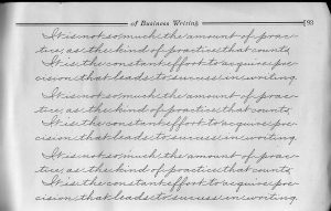
Indeed, the quality of penmanship used in cursive can create art in the same way as calligraphy. However, in general, cursive does not require an artistic element. In the 18th thru the 20th centuries, cursive was seen as a primary skill for business and politics. Especially in the 19th and 20th centuries, many cursive scripts were referred to as business writing.
However, there is an overlap in the definitions regarding the use of cursive in calligraphy. In this case, the difference in cursive vs calligraphy is primarily related to calligraphy’s use of shading. Modern cursive began to lose the consistent use of shading in the 20th century, primarily with the Palmer Method of Business Writing.

Until the Palmer Method became the primary form of cursive taught in the US in the 1910s, cursive used shading. From English Roundhand, introduced in 1733, to Spencerian script, first introduced in 1866, both used shading. Users of Spencerian script took special pride in their extravagant flourishes. Please take a look at our Constitution or our Declaration of Independence. These were written in English Roundhand, which heavily used shading, just like modern calligraphy. Historically, at this point in cursive’s evolution, the question of cursive vs calligraphy would not be obvious.
Looking at the published manuals for both Spencerian script and the Palmer Method, we can see cursive’s transition from artistic to purely business. For example, in Platt Rogers Spencer’s published manual, he wrote, “When we consider Penmanship as associated with these things [nature], it is no longer merely mechanical labor, devoid of interest and pleasure, but it is a noble and refining art, having charms which appeal to the finest susceptibilities of the heart.”

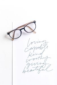
So, primarily from the Palmer Method and forward, cursive writing did not have any shade or variation in the line thickness. When calligraphy uses cursive, it is used with lines of varying thickness or shading. Shading was widely used before the Palmer Method, such as with the Spencerian cursive scripts flourishes. That was a shift between cursive vs calligraphy.
This gives us our modern definition for Cursive vs Calligraphy as primarily relating to intentional and consistent shading. The line thickness produced by the pen is intentionally added to match a particular pattern or style. Modern cursive does not use shading, while calligraphy does use shading. This is the difference in Cursive vs Calligraphy.
Although we are using the changes in line thickness as our definition of calligraphy, there is a distinction between artistic shading and personal style. In the study of cursive vs calligraphy, calligraphy uses specific shading. However, with flexible nibs, fountain pens can add varied line thickness that is characteristic of a personal style rather than a defined calligraphic style.
Nib flex is where fountain pens can add a personal touch. Each writer applies different pressure in their regular writing. The way someone holds their fountain pen can contribute significantly to individual line thickness.
If someone uses a grip such as the one taught in the Palmer Method, the pressure is very light. The Palmer Method teaches writers to keep their palms above the paper and only allow their fingers to glide on the paper. This type of grip will produce very different results than a more contemporary pen hold that rests the palm on the paper.
Fountain pens can add a personal style by the way the writer adds pressure to the nib. This is especially true for flexible nibs, such as nibs with more gold.
The varied line thickness is also historically true of the feather quill pen. Historically, each quill pen is made by hand. Therefore, the quill pen will naturally have a unique angle that leads to the pen point because it is handcrafted.
Another contributing factor to the individual uniqueness of quill pens is the flow of ink. This is also true between manufacturers of modern fountain pens. Each pen nib can produce slightly different line characteristics based on the flow of ink. A faster ink flow will lead to thicker lines and more natural shading.
The difference in ink flow can also be attributed to the brand of ink used with each pen. Some inks are thicker than others. The ink flow and nib characteristics create a formula for line thickness that individual writers often seek. Some writers prefer thinner inks to more viscous inks.
Though this individual style is not a defined calligraphic style, it is the kind of personality that fountain pens can give to any personal note.

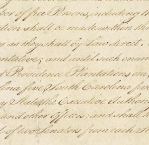
In contrast to these differences in line thickness based on personal style, calligraphy has a very uniform style that is taught. For example, in looking at a picture of the Constitution, the patterns of line thickness can be seen.
To further demonstrate cursive vs calligraphy, in the picture of the Constitution, notice the repeating and consistent patterns of shading. Notice the extended lowercase letterforms of the “f.” The shading is on the left side of the dipping lower loop extension. In contrast, notice the letterforms of the extended lowercase “y.” With the “y,” the right side of the extended lower loop is shaded.
Also, take notice of the uppercase “P.” The shading is consistent throughout the photographic excerpt of the Constitution. At the time of the writing of the Constitution, calligraphic line thickness was very important. The emphasis on uniform line thickness was particularly important due to the considerable differences in shading produced by different quill pens.
However, in both Calligraphy and individual cursive handwriting, art is present. With Calligraphy, the precision of the letterforms with exact shading is pure craftsmanship. With the varied line thickness sought and produced by individual cursive handwriting, the personal differences are almost as unique as their signature. In distinguishing cursive vs calligraphy, both standard cursive and calligraphy employ an artistic expression.